![]()
About
We build an interactive visualisation demonstrating the changing distribution of global market income since 1980. Our PPP-adjusted data on market income comes from the World Inequality Database (WID).
Watch how global inequality changed from 1980 to 2020.
-
Play the video below to see China moving from being among the poorest countries to an upper-middle income country (according to the World Bank) over this period.
-
And watch as inequality within countries increased all over the world, illustrated by the increasingly tall skyscrapers at the back of each country’s block.
Click here to go to the graphs
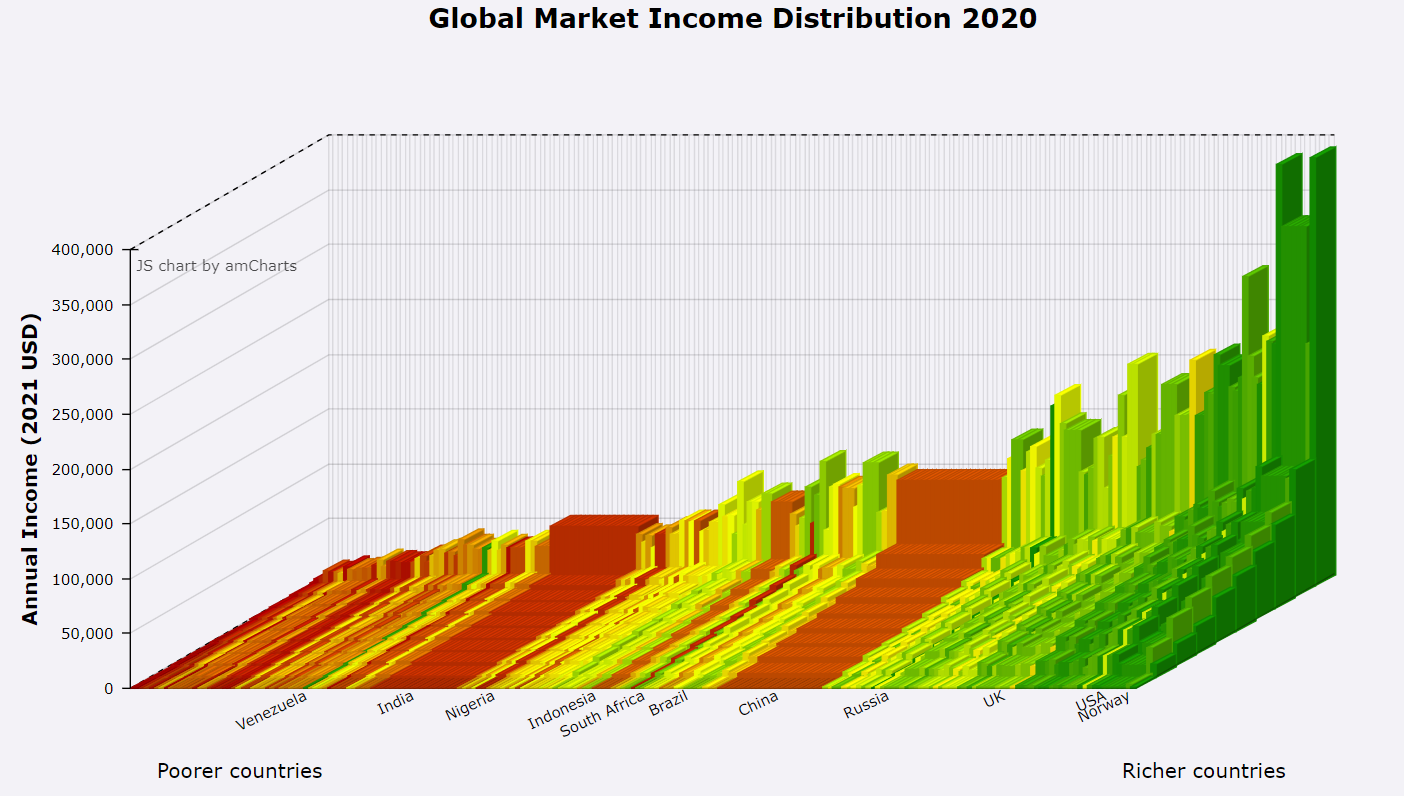
Below you can see the global market income distribution in 2020. Market income refers to the annual earnings of individuals before taking into account government transfers such as benefits and taxes. Taller blocks correspond to higher market income. Countries with larger populations are assigned wider blocks. Colours correspond to how rich the country was in 1980, with poorer countries shaded red and richer countries shaded green. Countries are ordered according to their national income per capita in each year, while holding colours fixed from the 1980 ordering. Therefore, with these figures we can see income inequality within and across countries over time as well as changes in national per capita income. Click on the picture to zoom into the global market income distribution.
These visualisations were created for The CORE Project. CORE is an open-access, interactive ebook-based course for anyone interested in learning about the economy and economics.
You can also explore similar interactive visualisations of global wealth inequality and global carbon footprint inequality in our companion websites: CORE Skyscraper 2: Exploring global wealth inequality and CORE Skyscraper 3: Exploring global carbon footprint inequality.
Download the data
Before you access the WID data that we use to create the skyscrapers, please note two things. First, the population data in our dataset does not include the total population in each country but only the adult population (people aged 20 or more). Second, our data reports pretax income in 2011 USD PPP. Unfortunately, other similar datasets do not always use the same measure of income. For instance, the Global Income and Consumption Project reports posttax income in 2005 USD PPP.
Such differences in recording income and population explain why you might notice some discrepancies between our dataset and other sources.
You can download the data here in xlsx or csv formats.
Contact
Questions? Comments? Concerns? Get in touch with Tzvetan Moev using tz.moev@gmail.com
Acknowledgments
This website is an updated version of Jack Blundell’s Globalinc. We have mostly used his coding for this project, so we owe him a massive thanks. This could not have been possible without his efforts.
For more information on how WID collects data on wealth and income, please refer to this report. If you are interested in exploring what is included in market income, search for variable aptinc in this variable table on WID’s website.
Visualisations created using amCharts.
Bob Sutcliffe designed the use of skyscraper diagrams for representing global inequality. A first version was published in: Sutcliffe, Robert B. 2001. 100 Ways of Seeing an Unequal World. London: Zed Books.